Responsive web design
Published - 9th June 2011

My eyes have been opened to responsive web design and there is definitely no going back for me.
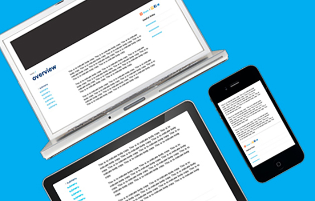
If you’re not familiar with responsive web design it’s basically a way of designing a website so it can adapt to different screen resolutions. Every user’s device is catered for, eliminating the risk of losing visitors. And, although flexible layouts are nothing new, the need for them is getting more crucial as more of us are using smart phones and tablets to view the internet.
I personally used to love designing a fixed layout website with everything in its exact place but it doesn’t always work well on smart phones. Constantly zooming in to view text and scrolling left, right, up and down just gets frustrating and can put a lot of visitors off.
One solution can be to design a separate mobile website. Now this is fine if the content on this version will differ from the full site. But if the content will be the same you would need to update both versions, which can be time consuming and costly.
This is where responsive design shows its brilliance. Not only would a website look fabulous on an average sized desktop screen but it would also automatically adapt to different screen resolutions and would even adapt to small smart phone resolutions.
How to create a responsive website
The combination of a fluid layout which uses flexible images and CSS media queries is the method to creating an adaptive website. CSS media queries are a brilliant way of controlling the way a layout can change as they basically let you apply different style sheets to different screen resolutions.
For more in-depth information on media queries please see this post on Web Designer Wall.
Thinking differently
Responsive web design isn’t just about the coding and technology behind it, but it also requires a different way of thinking. I’ve only just discovered the beauty of responsive web design and it can take a while to figure out how each element will adapt in relation to other elements, eventually creating layouts that work at every resolution. But it is well worth the effort and, with more and more of these sites popping up, responsive web design is certainly looking like the way of the future.
Harris »