Under construction: web design for the construction industry
Published - 22nd February 2019

Ongoing developments
The last couple of years have seen a number of great digital developments which I’m excited about, and hope to see more of.
Animation
The use of animation has risen over the past year or so. I’ve really gotten into motion in web design over the past year, and I love making websites look and feel more interactive through features such as hover effects or animations which help to direct the user through content.
Features like this really make websites pop for me. I love websites that are interactive and look different to the current norm, so I hope to see a lot more interactive websites through the year.
Brutalism
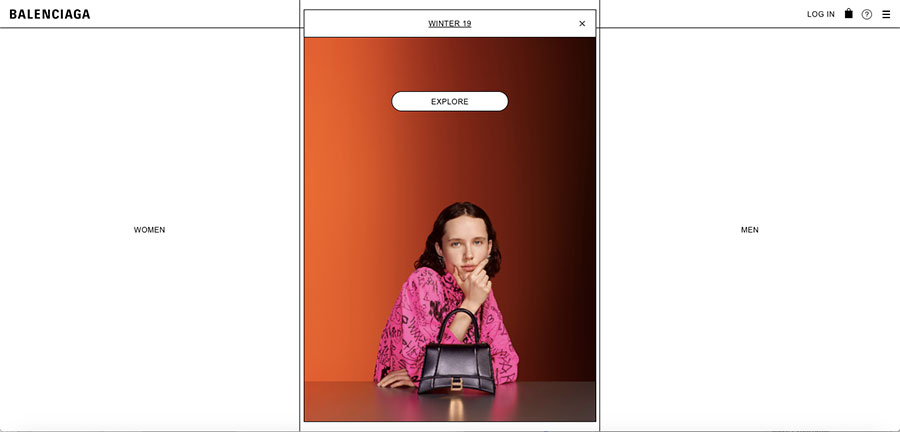
While brutalism in architecture simply means minimalistic, brutalism in web design goes beyond that. Where minimalism has a form over function approach to styling in a website, brutalism has no styling and the website content is left in its raw form.
One of my favourite examples of brutalism in practice is Balenciaga’s website.

Natural and organic shapes
Over the past year we’ve seen a rise in websites shifting away from the standard grid system, and I’m expecting to see this go one step further this year, with more and more organic shapes. I’m a huge fan of this as, in all honesty, I’m bored of squares and boxes in web design – there’s no need to stick to these when technological developments allow us to do so much more.
Moving away from straight lines and squares for elements has worked beautifully in most cases, and I’m especially a fan of shapes which look almost hand drawn. I’m hoping that more websites lose squares and boxes in favour of more natural and organic shapes.
CSS grid layouts
I recently started using CSS grid layouts and it’s been life-changing! Flex is great, but flex and grid is the holy grail of web development. CSS grid is a two-dimensional system which makes controlling rows and columns so much easier. It’s cleaner, more effective and needs less overall styling.
While I’ve started using CSS grid layouts and it’s made such a huge difference for me, I’m part of the minority so there’s definitely room for growth.
Web design for construction
Before I joined Harris, I’d worked on websites for a number of sectors, and I haven’t seen any real difference in the core of creating a website for a construction firm compared to other businesses in different sectors. This isn’t because the construction sector isn’t unique, but because the development and function of a website always depends on the client and the needs of its audience – no matter which sector it’s in.
Every website, whichever industry it belongs to, should be viewed as a unique opportunity to do something targeted and different – otherwise we may as well be creating them from templates, making all websites look the same.
That being said, through my research I’ve noticed that there does seem to be a similar format to many construction business websites, so it’s time to start thinking bigger and thinking differently.
Unless your needs and target audiences require a certain format, just because something’s the norm in the industry doesn’t mean that you need to follow suit. It’s time for the construction industry to start being more bold when creating websites, whether that’s through creating a more interactive experience, stripping back to core functionality, or something in between – this is the direction we’re looking forward to taking with our clients over the next 12 months.
My overall impression of websites in the sector is that we need to see more which are outside the box – this is something I’m looking forward to being a part of in my role at Harris, client permitting of course!
If you’re looking to create a new website and think our experienced team can help, get in touch for more information.
Harris »