Sign of the times
Published - 5th August 2020
As people across the country emerge from their hastily-assembled home offices and start to confront ‘the new normal’, our designer Emily Kaye looks at how workplaces can apply good design practices to make sure that colleagues get the message about safety and social distancing.
The good, the bad, and the ugly
As a bit of a design geek, I’m always looking out for what I do and don’t like in design – and there has been plenty to catch my eye during lockdown! So when I started looking at our office signage as part of our risk assessment, I had a pretty clear idea of what I didn’t want it to look like.
So – no cluttered signs, no hard-to-follow fonts, and definitely no ugly colour combinations. But if you’re planning on putting signage around to encourage good hand hygiene and social distancing, what should you look to include?
A good sign will be noticeable, understandable, informative and easy to read at a glance. The main aims should be legibility and visibility. To make sure your signage achieves this, it’s worth going back to basics.
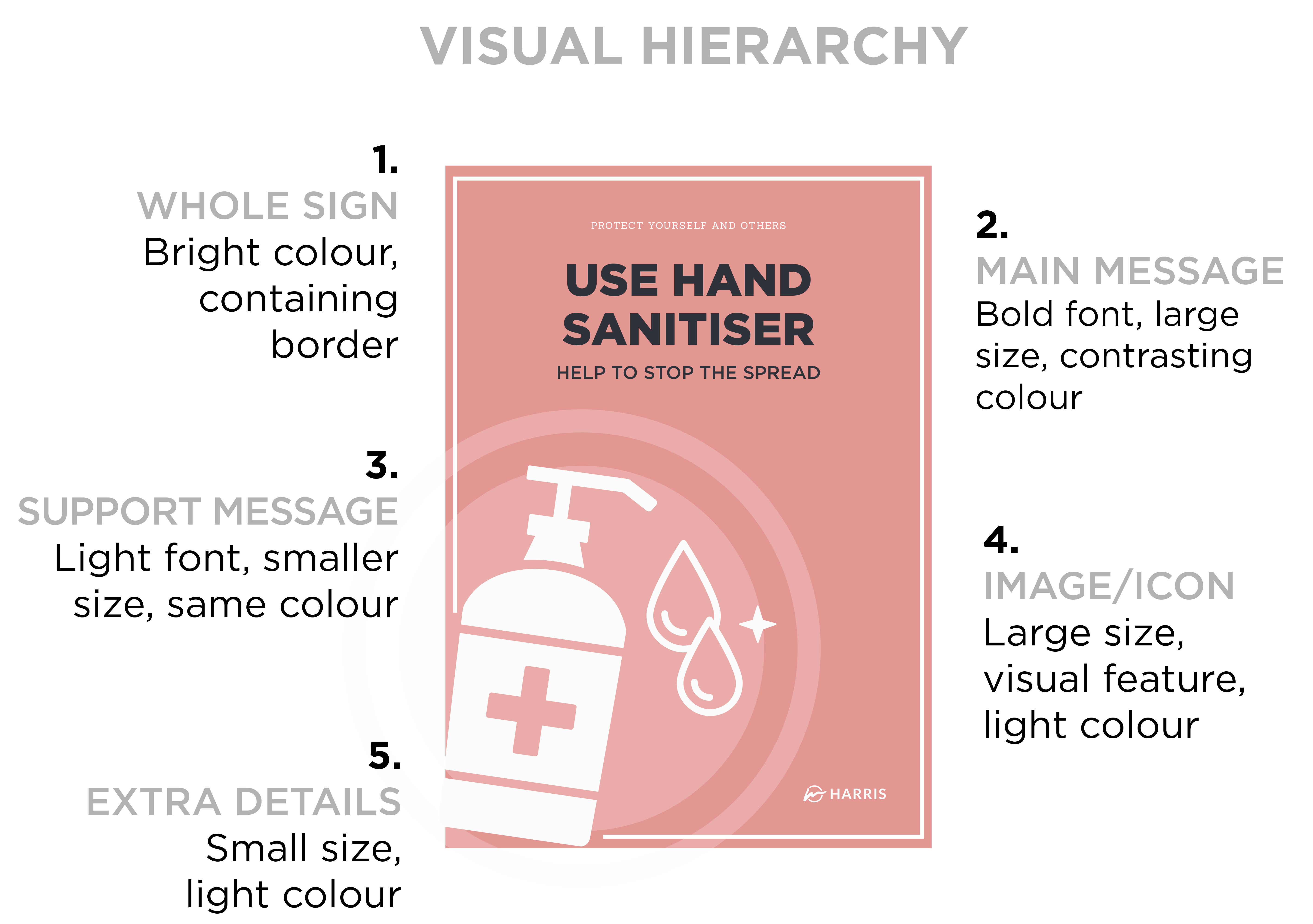
In design, we talk about ‘visual hierarchy’: that refers to where your eyes look first based on design features including layout, colour, and size of information. These elements should combine to create a hierarchy and direction of reading – the image below is an example of a successful sign, labelled with where your eye looks first and how/why:

It’s worth breaking it down in more detail:
Overall impression
You’ll notice that I’ve used a single colour here; this helps the sign to stand out, even against a busy background like a noticeboard. The full border also focuses attention and separates the sign from any background detail.
The colour is eye-catching but not alarming – it’s softer than, say, a bright red sign, which works when we’re wanting to nudge people into good behaviour. Sticking to just three colours for the palette (white accents, bold background and dark text) prevents the sign from being overcrowded so the message is easy to absorb.
I’ve included plenty of clear space, which avoids the sign becoming cluttered and lets the message speak for itself. Blank space isn’t a bad thing, and I’d recommend leaving at least 40 per cent of the space clear: think of the space as supporting the message.
Main message
This is the main focus of the whole sign, and it stands out thanks to contrasting colours and minimal text: dark text on a light background is easiest to read, which is especially important when designing for accessibility. When creating signage, I operate on the basis of five words per statement maximum – small statements are easy to read, understand and remember, and we don’t want the message to be overwhelming.
The use of different font sizes and weights means you can guide the eye to the most important part of the message – in this case, I’ve put the central message in a large, bold font to show that it’s the central point.
Supporting message
Here, I’ve used a lighter font and smaller size. This means the secondary message doesn’t detract from the main text, and readers instantly understand that it’s not as important.
However, it’s still in the same contrasting colour: it still needs to be easy to read, and it gets across the fact that this is all part of the same overall message, and will encourage people to read the whole text.
I wouldn’t recommend changing font, or definitely not using more than two different options – sticking with the same one declutters the sign and eases reading, and we want this to be simple and clear.
Images or icons
I use images or icons to reinforce the written message and visually present information for ease of understanding. After all, a large image is easier to process than lots of text – your mind ‘gets it’ instantly.
However, by using a light colour and a simple icon style, the image isn’t the main feature: it’s there to support the text, not split people’s attention, so make sure it’s not the only thing the reader notices. A fussy image will overcomplicate things and distract from the message.
Branding and other extras
When we’re talking about safety and social distancing, your brand is not the most important thing to consider. By all means, include some branding or a logo – but understand that it’s not vital information, and it’s no loss if no one notices it.
Go for a lighter colour than the rest of the design, and keep it small but recognisable – your brand will probably be reassuring to people who know it well, and it’s good to include some personality.
Overall, there are a few key tips I think everyone should stick to when putting their signage together:
- Use minimal written content – it avoids distractions and keeps the message clear.
- Look at your messages carefully – what does each element add? If the answer is ‘nothing’, remove it!
- Watch your tone – signs should be informative and assertive, but not tip into being alarming or worrying. Keep it friendly, and focus on encouraging people to work as a team to follow the rules. And definitely avoid jargon.
- Choose fonts wisely – using lots of fonts looks ugly, so use a single font where possible, and create a hierarchy of text by using different sizes and weights. Sans Serif fonts are the best for signage as they are clean and accessible – think Ariel, Helvetica and Calibri.
Harris »